updated on 17 Jan 2025

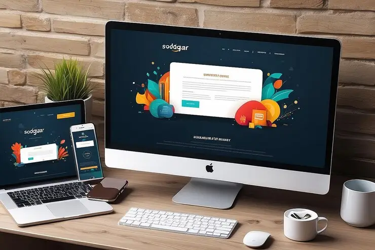
In today's fast-paced digital world, where smartphones have become an integral part of our lives, having a mobile-friendly website is no longer an option—it's a necessity. With a growing number of users accessing the internet exclusively through their mobile devices, businesses must prioritize responsive web design to remain competitive and relevant.

Why Mobile-Friendly Web Design Matters:

  1. Improved User Experience: A mobile-friendly website ensures that users can easily navigate and interact with your content on any device. Whether they're browsing on a smartphone, tablet, or desktop, a responsive web design adapts seamlessly to different screen sizes, providing a smooth and enjoyable experience.
  2. Boosts Search Engine Rankings: Search engines like Google prioritize mobile-friendly websites in their rankings. With Google’s mobile-first indexing, the mobile version of your site becomes the primary factor in determining your search engine ranking. By investing in professional website development, you’re not only enhancing usability but also increasing your chances of being discovered by potential customers searching for web developers near me.
  3. Higher Engagement and Conversion Rates: A website optimized for mobile devices loads faster and is easier to navigate. This leads to lower bounce rates and higher engagement, ultimately resulting in better conversion rates. If your goal is to drive sales or generate leads, mobile-friendly web design is the key.
  4. Catering to the Modern Consumer: Statistics show that over 60% of all internet traffic comes from mobile devices. Consumers today expect instant access to information, and if your website isn’t optimized for mobile, they’ll likely move on to a competitor’s site. A responsive web design ensures you capture and retain the attention of your audience.


How to Achieve Mobile-Friendly Web Design:

  1. Responsive Design: Work with experienced web developers to create a site that automatically adjusts its layout based on the user’s device. This ensures consistency across all platforms.
  2. Fast Loading Speeds: Optimize images, minimize code, and leverage caching to ensure your site loads quickly on mobile devices. Slow-loading websites can significantly harm user experience and SEO rankings.
  3. Mobile-Friendly Navigation: Simplify menus and use clear call-to-action buttons that are easy to tap on smaller screens. Ensure all links and forms are functional and user-friendly on mobile devices.
  4. Test Across Devices: Before launching, test your website on various devices and browsers to ensure flawless functionality and design.


Choosing the Right Web Developers:
Finding the right professionals for your website development needs is crucial. Whether you’re starting from scratch or revamping an existing site, look for "web developers near me" who specialize in responsive web design. Local experts can offer personalized services and understand the unique needs of your business and target audience.

In the digital age, mobile-friendly web design is a cornerstone of successful online presence. It enhances user experience, improves search engine rankings, and drives better engagement and conversions. By partnering with skilled agencies along The Brand Stori, prioritizing responsive website development, you can ensure your business remains competitive in an increasingly mobile-first world. Ready to take your website to the next level? Contact us now for expert web design and development services that will help your business stand out in the digital landscape.
 

Need help?